Week 42: FMP- Image of Final Project development & Personal Icon
by wangtianchen
The graphics team require us an image of our Final Project development work to include on a website and poster and an icon design for ourselves to present on the exhibition.
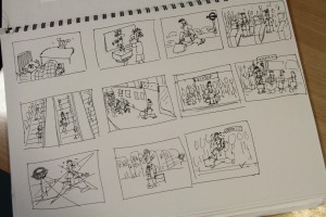
This is the image what I chose from my research and sketchbook that I think it communicates my project. Basically, the original image was a scenario of user experience journey which I made for develop my project during research period. Though the user journey you can find some problems clearly, this is what I want.
An image of our Final Project development work to include on a website and poster
Original image was a scenario of user experience journey in my research
This yellow and blue with a tinny red box image is my icon for the FMP exhibition. The icon is based on my English name ‘Tina’, ‘Tina’ has the similar pronunciation as Chinese ‘天哪’ which means ‘Oh My God’ and also always have surprise when people saying ‘OMG’. So I hope my FMP project can display surprise to viewers and heard ‘OMG’. In terms of the colours, I chose three-primary colours, because the colours of every projects are based on three-primary colours, every good designs are also based on primary things.
Icon-Tina

